Create a side-by-side plot of time series and histogram
Source:R/sbs_plot.R
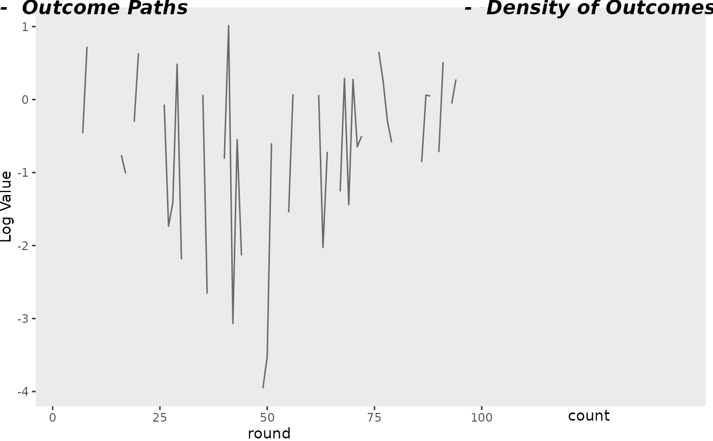
create_side_by_side_plot.RdCreate a side-by-side plot of time series and histogram
Usage
create_side_by_side_plot(df, use_log = TRUE, quantiles = c())Arguments
- df
A data frame with columns
round,value, andindex- use_log
Whether to use a log scale
- quantiles
A vector of quantiles to show as lines
Examples
create_side_by_side_plot(data.frame(
  round = 1:100,
  value = rnorm(100),
  index = "A"
))
#> Warning: There was 1 warning in `dplyr::mutate()`.
#> ℹ In argument: `value = log(.data$value)`.
#> Caused by warning in `log()`:
#> ! NaNs produced
#> [1] "median NA"
#> [1] "mean NaN"
#> Warning: Removed 6 rows containing missing values or values outside the scale range
#> (`geom_line()`).
#> Warning: Removed 1 row containing non-finite outside the scale range (`stat_bin()`).
#> Warning: Removed 1 row containing missing values or values outside the scale range
#> (`geom_vline()`).
#> Warning: Removed 1 row containing missing values or values outside the scale range
#> (`geom_vline()`).